Neoke App Case Study:
Revolutionizing the Travel Experience with
Digital Identity, Information Management & AR
Summary
Neoke is an innovative startup that has transformed the travel experience by introducing a digital wallet for managing identification processes. The Neoke app empowers travelers to efficiently manage their digital information, simplifying access to hotels, airports, and security checkpoints.
Team
Parvin Bayathojati, Nicolas Balbontin& Martin Caneda
Tools
Figma (+Figjam), After Effects, Photoshop, Illustrator
Deliverables
High-fi prototype of a mobile app, and presentation deck.
Role and responsibility
In this project, a team of three UX/UI designers, including myself, collaborated to successfully execute the following tasks:
- User Research
- Persona Development
- User Journey Mapping
- Problem Statement Formulation
- Ideation & Brainstorming
- Wireframing
- Usability Testing
- Accessibility Considerations
- Moodboard & Style Tile Creation
- High-Fidelity Design

The Problem
The challenge was to integrate a new feature into the Neoke app, specifically a form scanning feature. The goal was to modernize the travel experience by automating the process of filling out paper forms, making it more efficient and convenient for travelers.

The Goal
The primary goal of this project was to enhance the Neoke app by introducing a form scanning feature, empowering travelers to automate the process of filling out paper forms during their journeys, ultimately making travel smoother and more efficient.
01
Understanding the user
. Competitive analysis & User research
. Pain points & Empathy map
. Personas
. User journey maps
. Problem statements
Competitive analysis & User research
We conducted extensive user research to better understand the challenges travelers face when dealing with paperwork during their journeys. Initially, we assumed that hotel check-in processes would be a significant pain point, but our survey of 75 participants surprisingly revealed that users did not encounter substantial issues in this area.
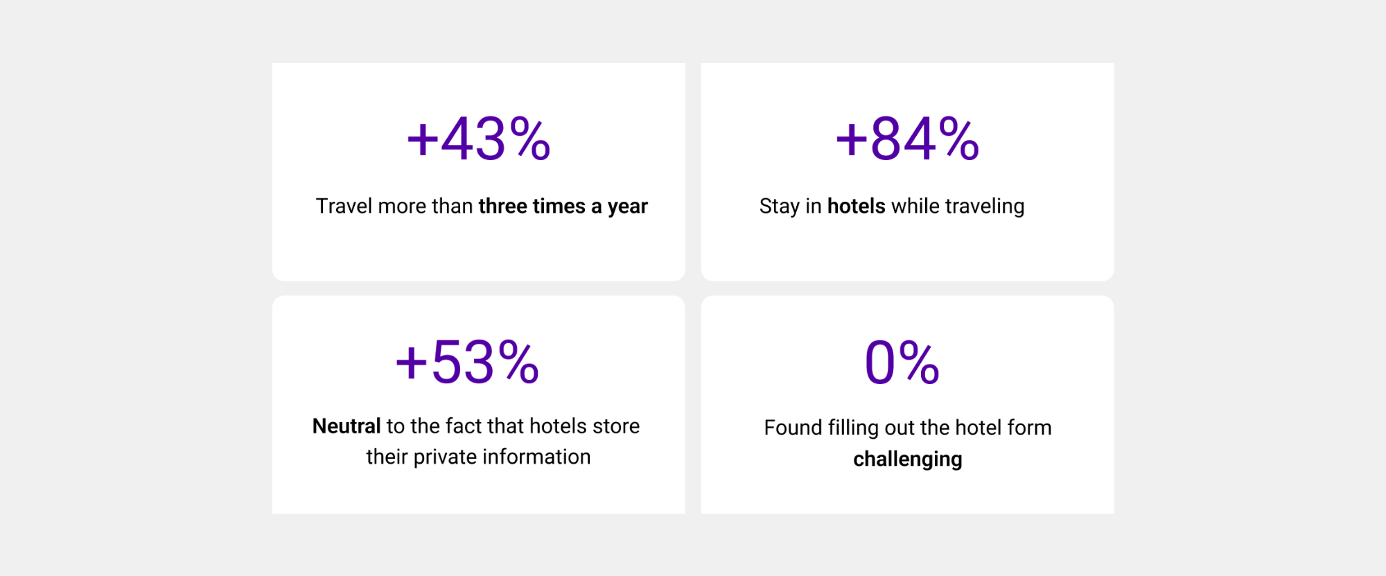
This led us to question how we could solve a problem that stakeholders were keen on addressing when users didn't perceive it as a pressing need.
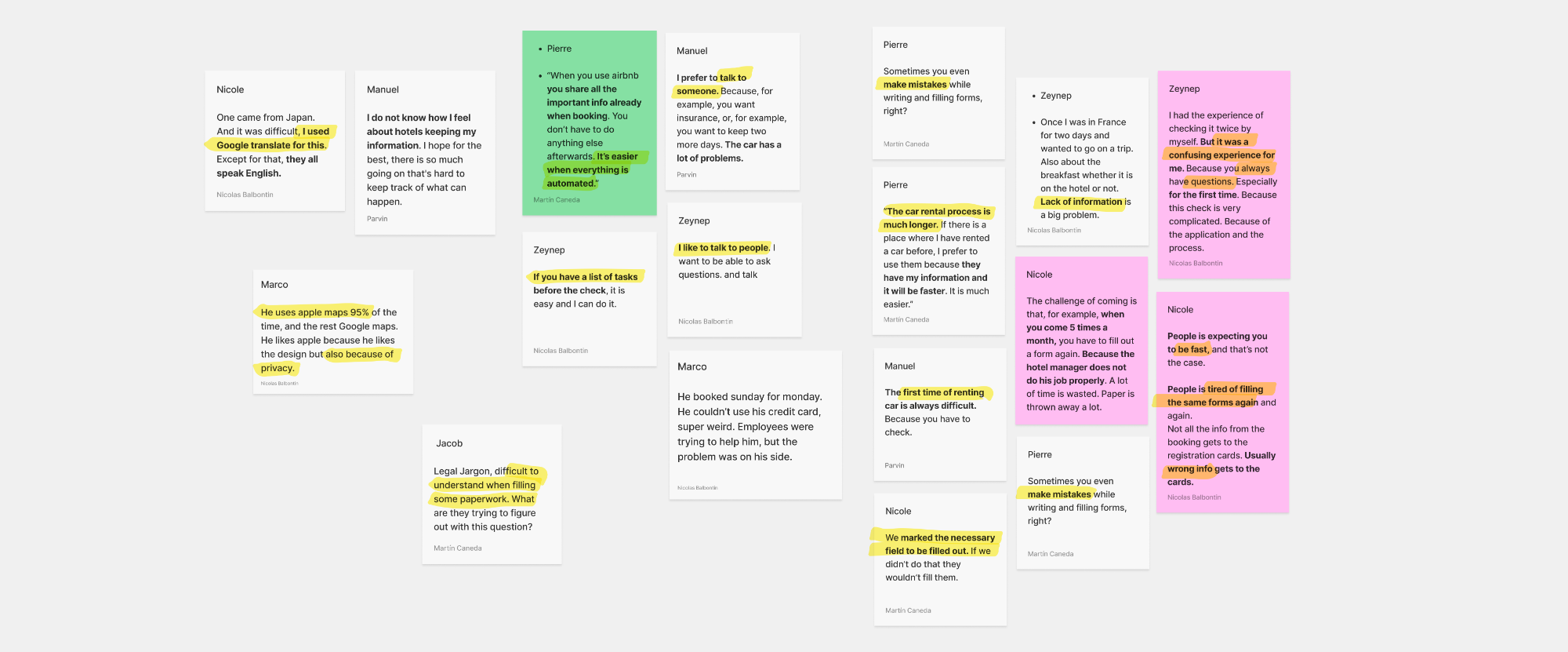
However, our research took a positive turn when we expanded our focus beyond hotel check-ins. Interviews with 7 travelers exposed pain points related to paperwork in car rentals, bureaucratic situations, and international travel.
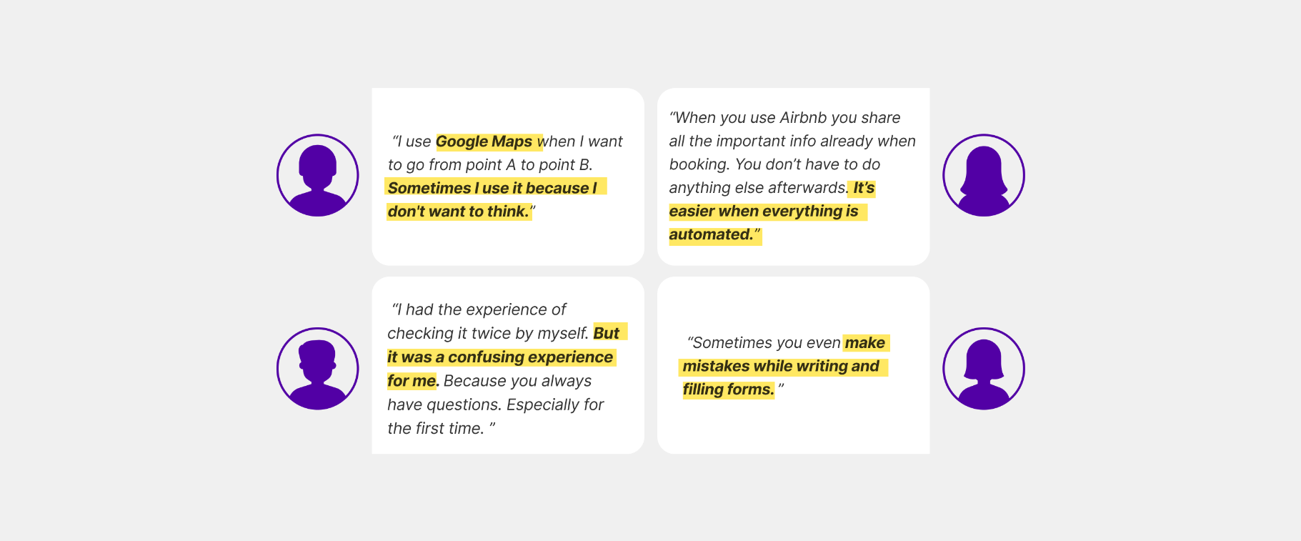
We utilized an affinity diagram to organize insights and extract data effectively.
Pain points
Users disliked redundant paperwork, were averse to time-consuming processes, and preferred a streamlined, proactive travel experience. This shift in perspective provided us with valuable insights and opportunities for designing a more effective solution.
Paperwork Frustration
Users hate doing the same paperwork again and again. We'll make it easier by automating data retrieval and pre-filling forms.
Streamline complex tasks
People don't like tasks that take too much time or thinking. We'll simplify everything with clear instructions and automation.
Smooth Travel Planning
Users want a hassle-free travel experience. We'll help them plan ahead and provide all necessary information for a stress-free journey.
Efficient Travel Experience
Users want a smooth journey overall. We'll create a user-friendly, personalized solution to make travel efficient and enjoyable.
Empathy map
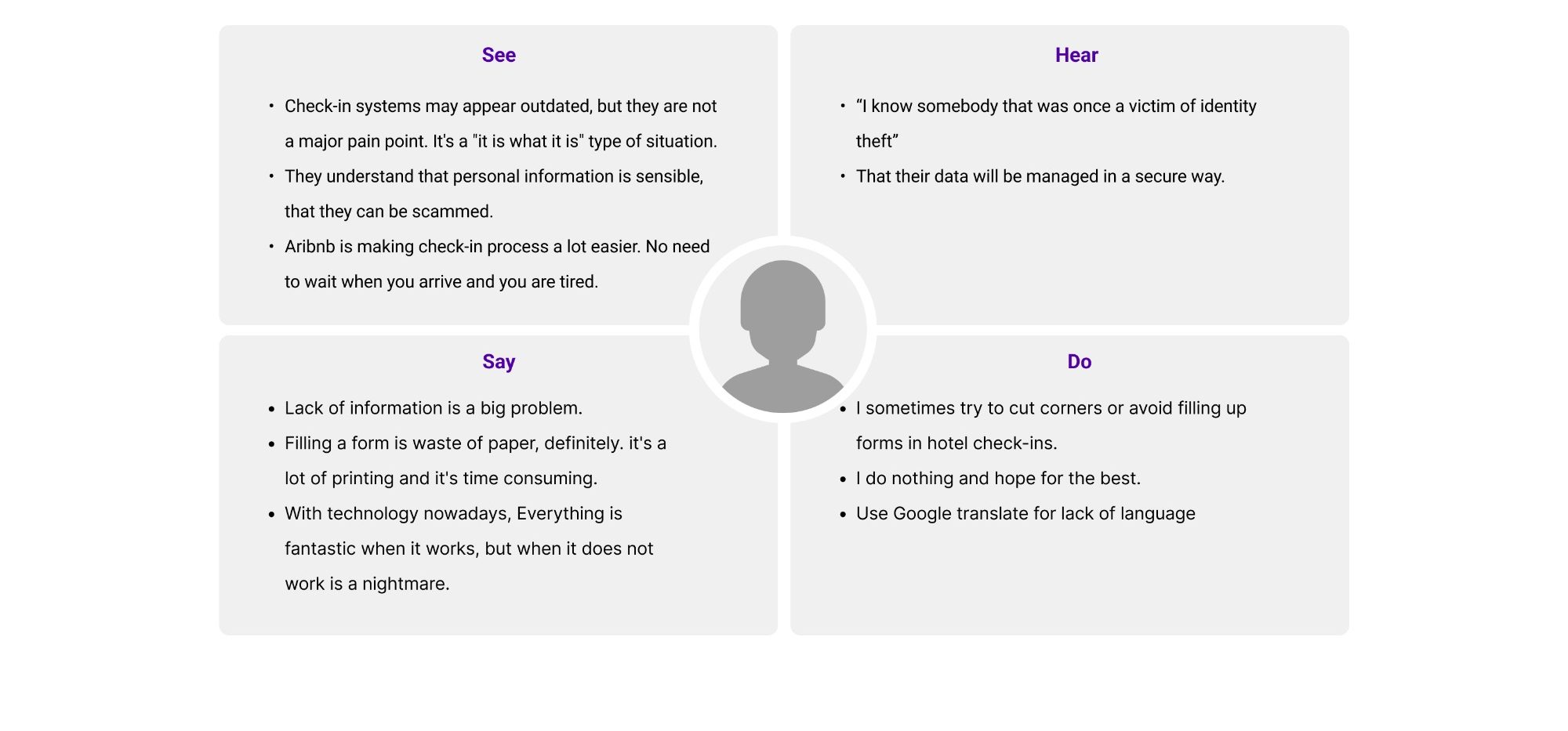
After conducting interviews and organizing our insights with an affinity diagram, we harnessed the power of an empathy map to truly understand the traveler's frustrations and aspirations. This empathy map became our compass for designing a solution that would revolutionize their travel experience with Neoke's Digital Wallet Enhancement.
User persona
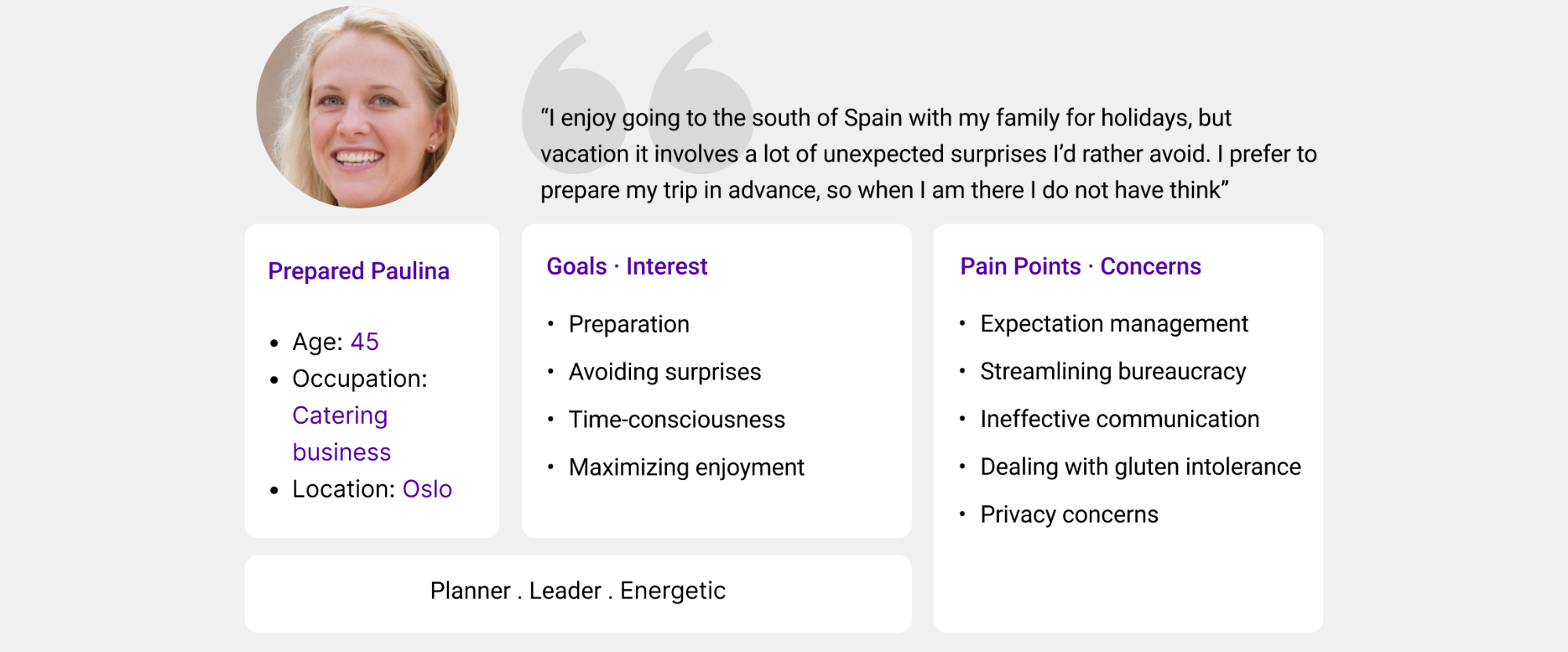
Meet Paulina, a mother of three and the owner of a catering business in Oslo.
User journey map
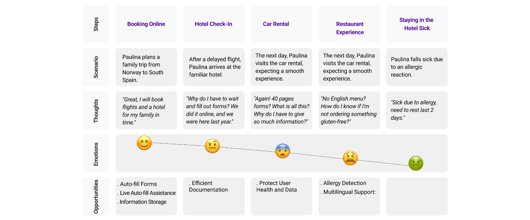
Paulina diligently prepares for her trip from Oslo to Spain. However, due to a three-hour flight delay, she and her hungry kids finally arrive at their hotel in Spain, exhausted and famished. To her dismay, she's confronted with the need to fill out paperwork not only for herself but also for her husband and children, further delaying their much-needed rest.
The next day, they face another setback when they encounter a frustrating hour and a half wait at the car rental agency. To compound her frustration, Paulina is presented with a daunting stack of paperwork to complete and sign before they can finally get on the road.
Later, while dining at a local restaurant, Paulina encounters yet another challenge. She struggles to decipher the Spanish menu, and her daughter unknowingly consumes peanuts, triggering a severe allergic reaction. This series of unexpected events adds stress and anxiety to what was supposed to be a relaxing family vacation.
Problem statement
People traveling abroad need to find a way to navigate freely, protect their data, and be understood because they want a stress-free experience.
HMWS...?
With the problem statement in mind, we devised three fundamental questions to steer our approach.
- How might we aid Neoke Users navigating forms & docs outside of the Ecosystem?
- How might we help parents managing their kids' IDs while on holidays?
- How might we facilitate communication with service providers when language is a barrier?
02
Starting the design
. Information Architecture
. User flow
. Early Concept
. Low-fidelity prototype
. Mid-fidelity prototype
. Usability studies
Information Architecture
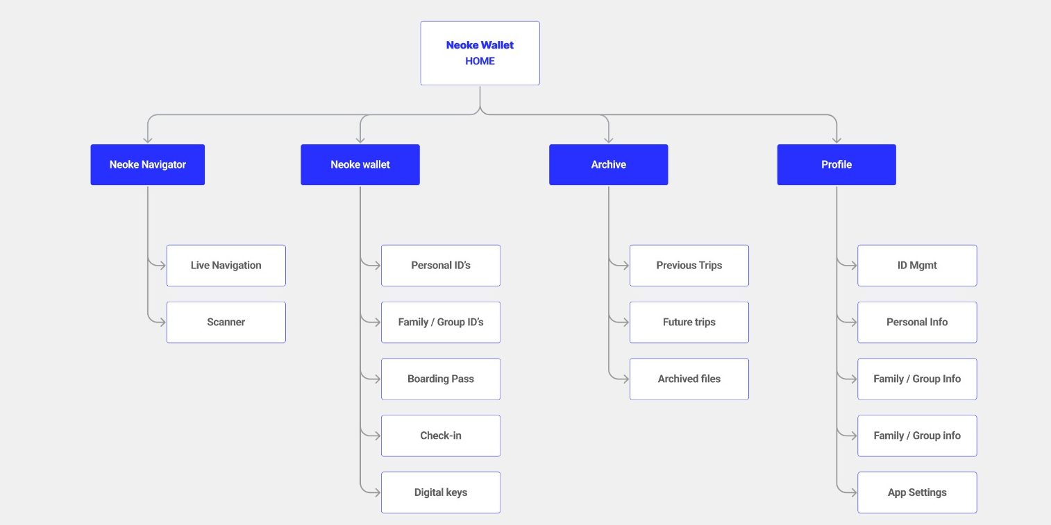
We've revamped the app with four main sections:
- Wallet (Home): Get quick access to essential travel info like personal documents, group documents, boarding passes, and hotel tickets.
- Navigator: Scan and translate documents, QR codes, and menus while safeguarding your privacy.
- Archived Files: Store past info not on the home screen.
- Profile: Edit and add personal travel info.
User flow
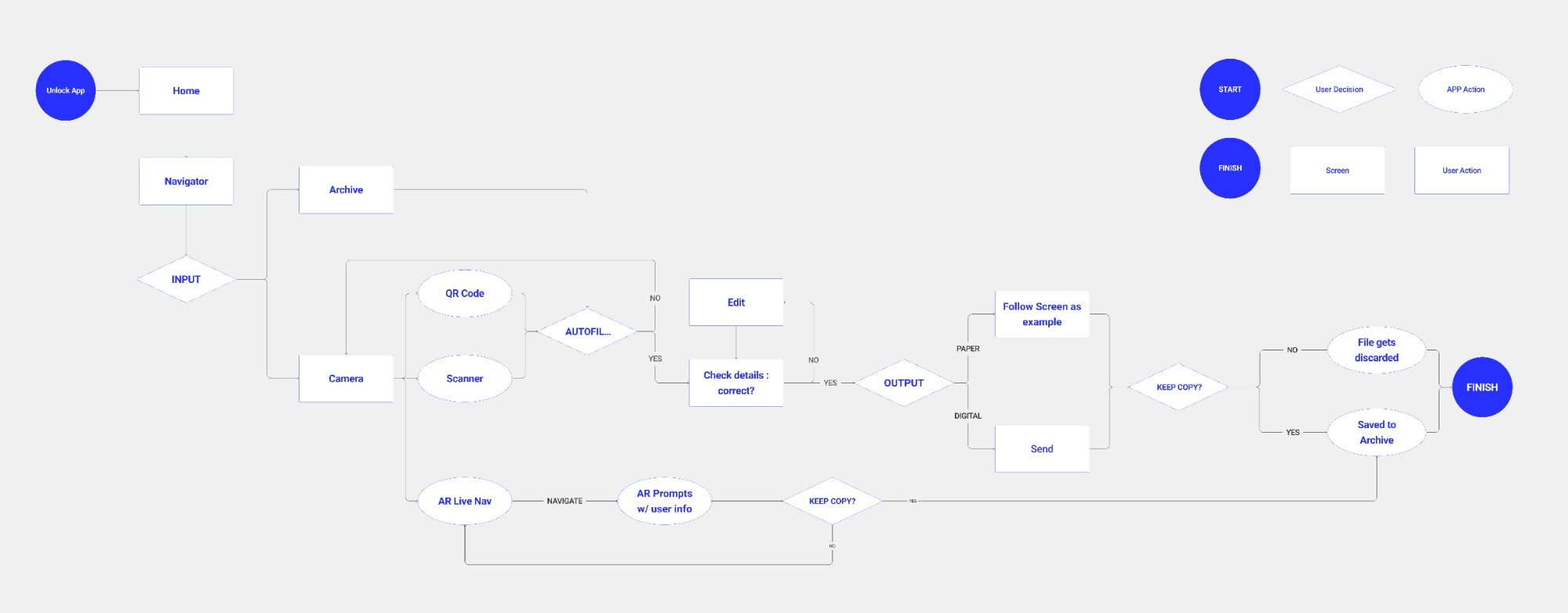
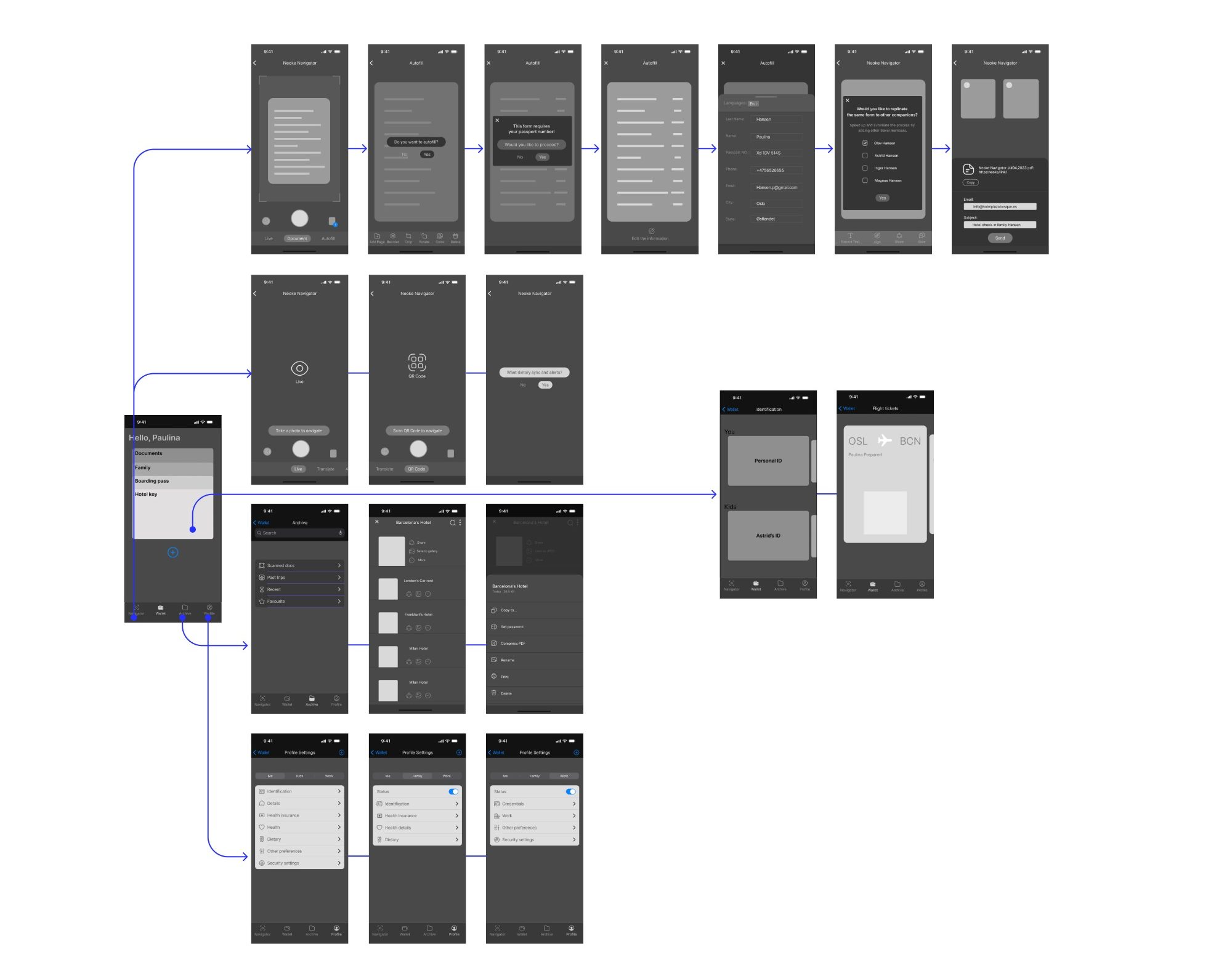
In our project, the star of the show was our navigator, and we crafted three user flows to bring it to life:
- Paulina's Journey: She starts her journey by logging into the app and updating her profile with all the essential information needed for her travels.
- Form Scanning Magic: Paulina smoothly scans a form with her phone, and the app automatically fills it out and sends it on her behalf, saving her time and effort.
- Dining Delight: The app translates the menu in real-time, detects potential allergies, ensuring her dining experience is delightful and safe.
Early Concept
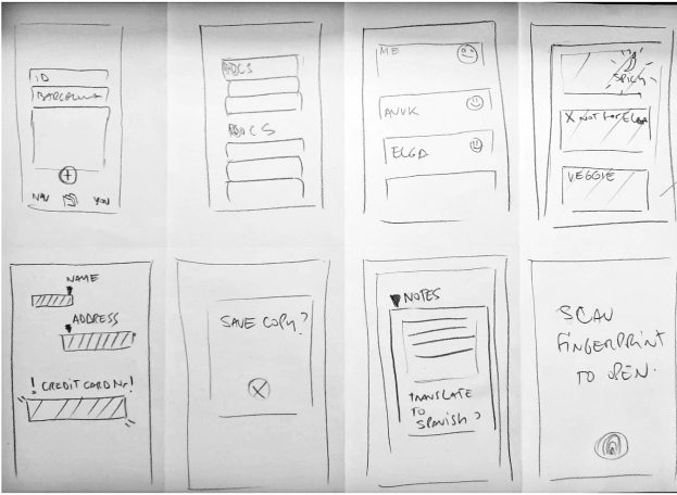
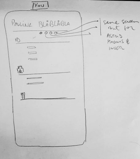
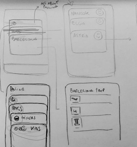
Once we had our site map and got the green light from stakeholders for our basic plan (MVP), we started brainstorming creatively. We carefully looked at different design ideas and where to put things on the website.
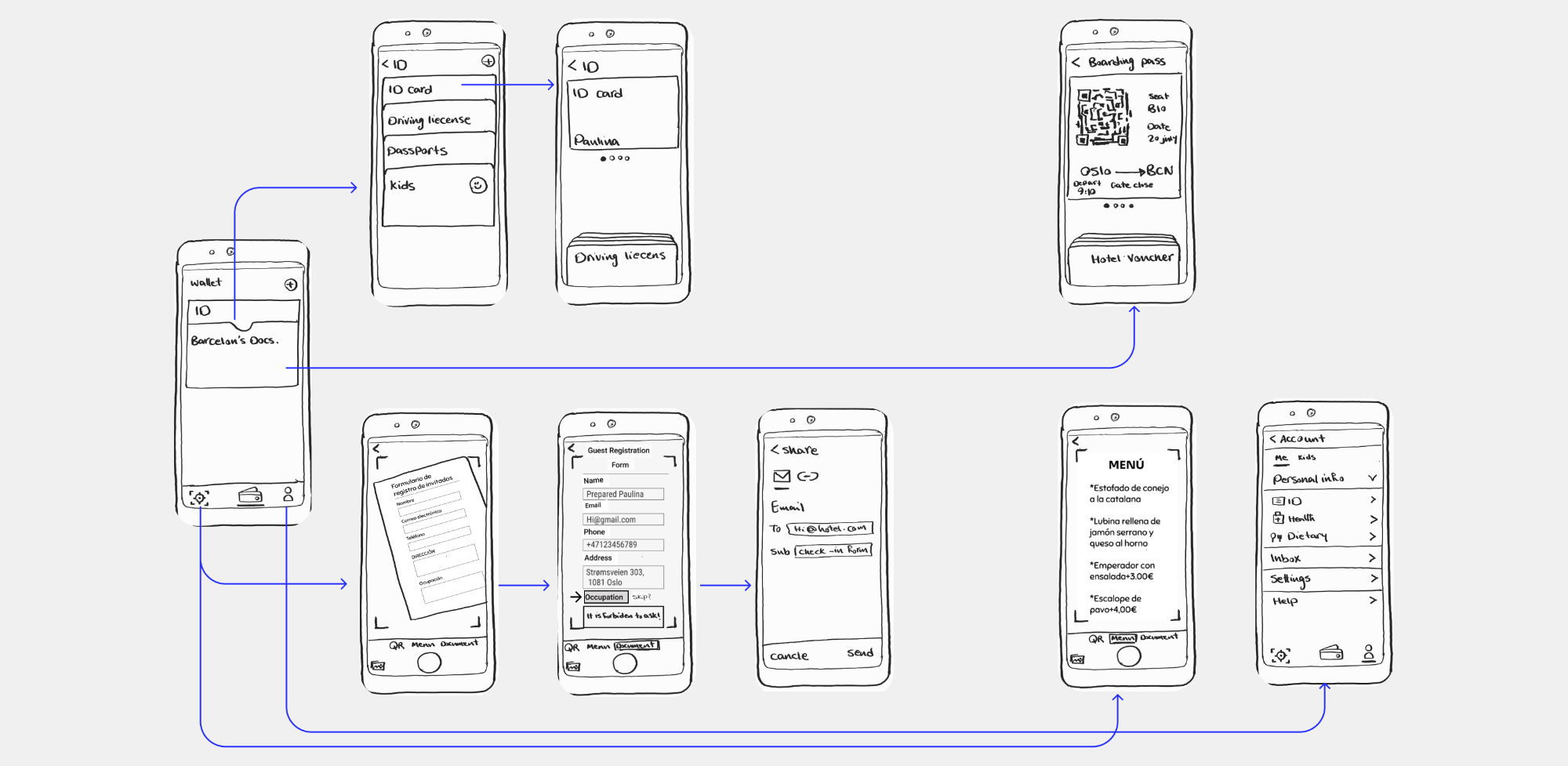
Low Fidelity & Concept Testing
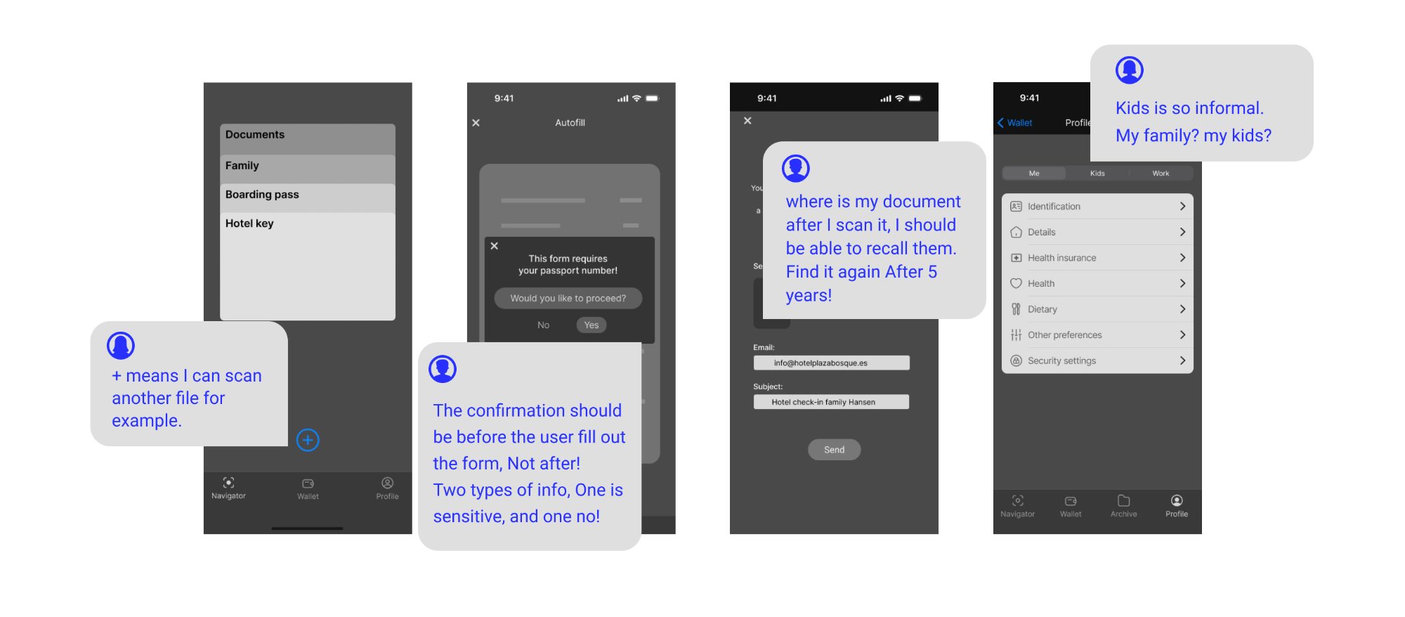
Next, we prototyped the initial concept and conducted tests with various users. Their feedback played a crucial role in enhancing the design of MidFidelity and implementing necessary changes.
Mid Fidelity & Usability Testing
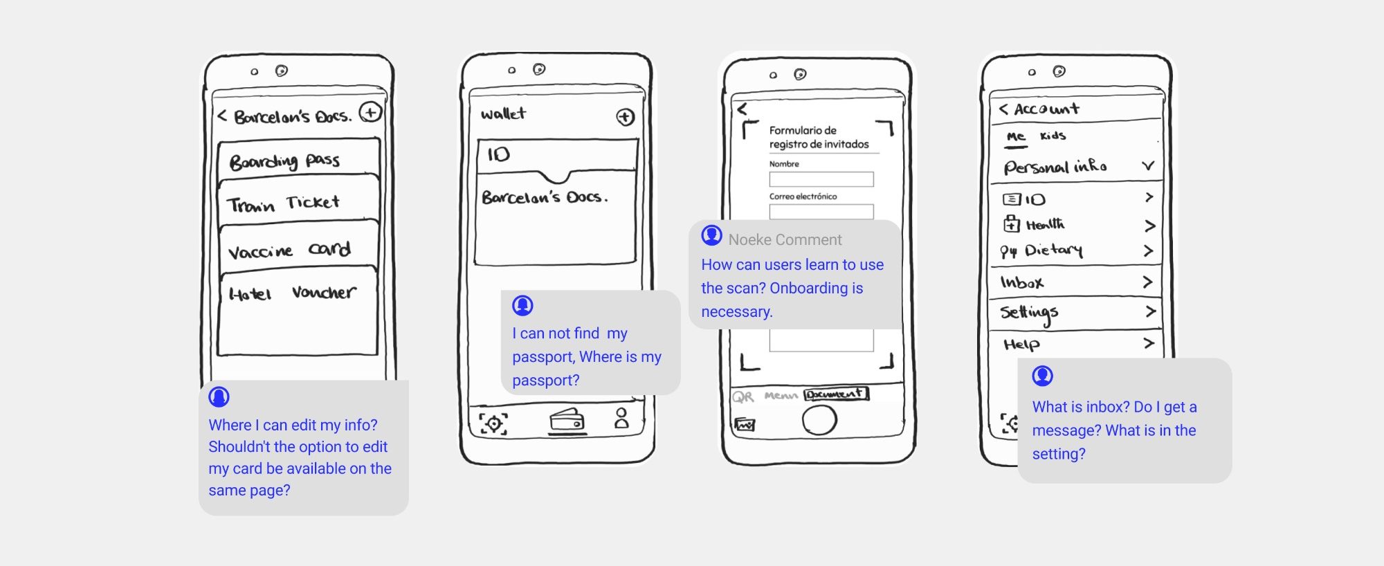
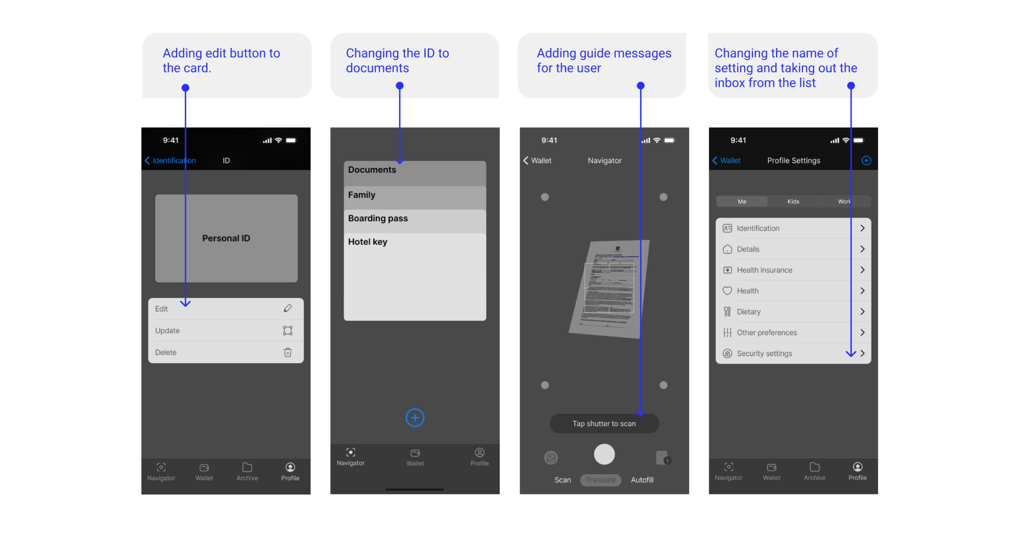
After our low-fidelity prototype test with 5 users, we moved on to the mid-fidelity stage. Here, we implemented design changes based on user feedback. Subsequently, we conducted further tests, involving both users and stakeholders.
03
Refining the design
. Branding
. High-fidelity prototype
. Accessibility
Branding
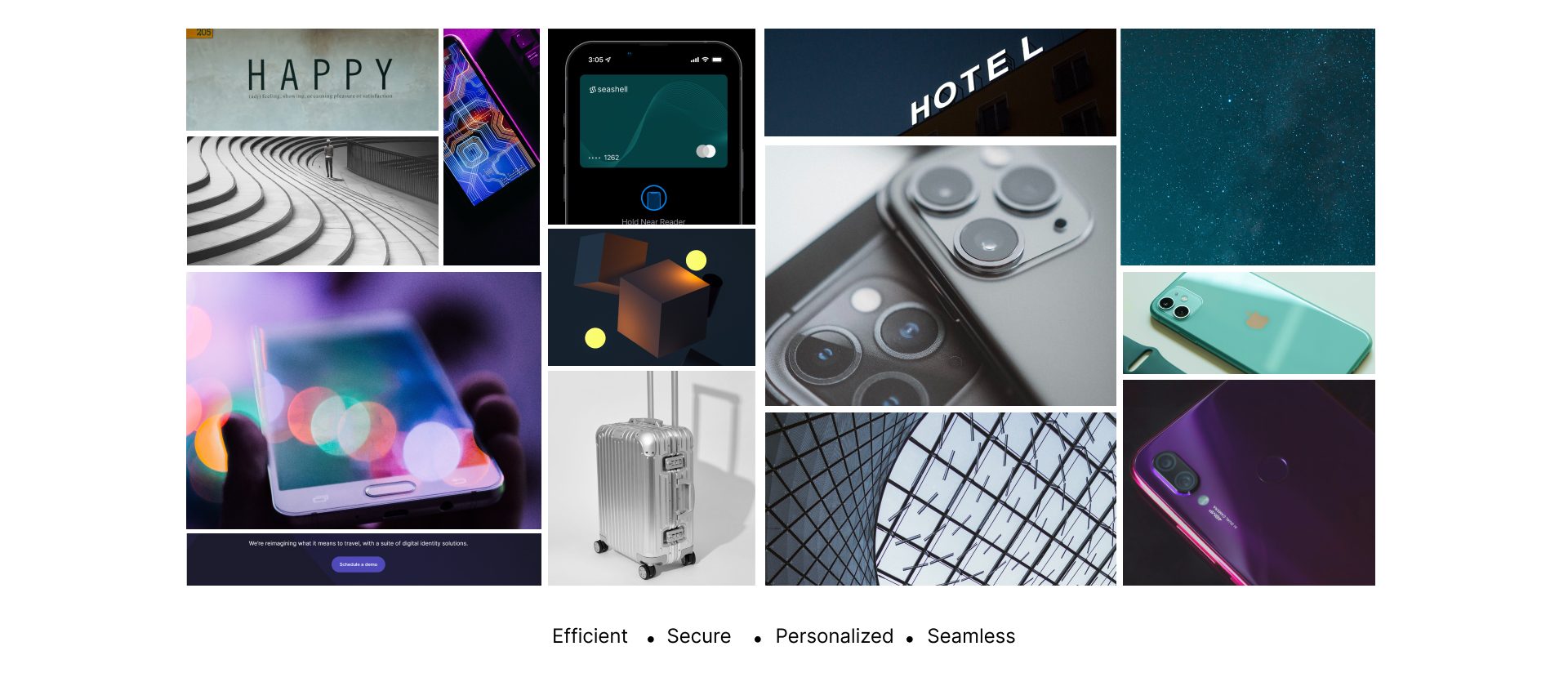
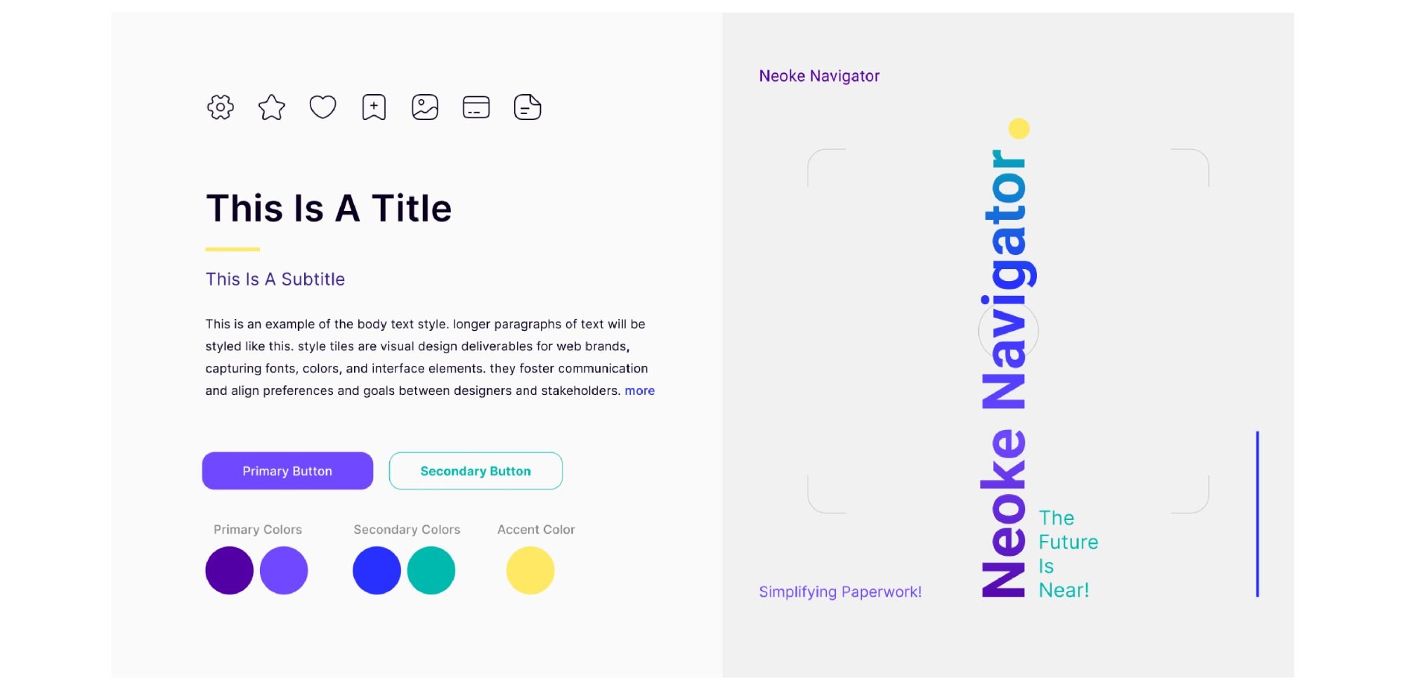
n our branding efforts for Neoke's app, we recognized the need to balance its professional image with a more user-friendly appeal. To achieve this, we followed an iterative approach:
- Inspired by Moodboard and User Testing: We began by creating a moodboard and refined it based on user testing and Neoke team approval.
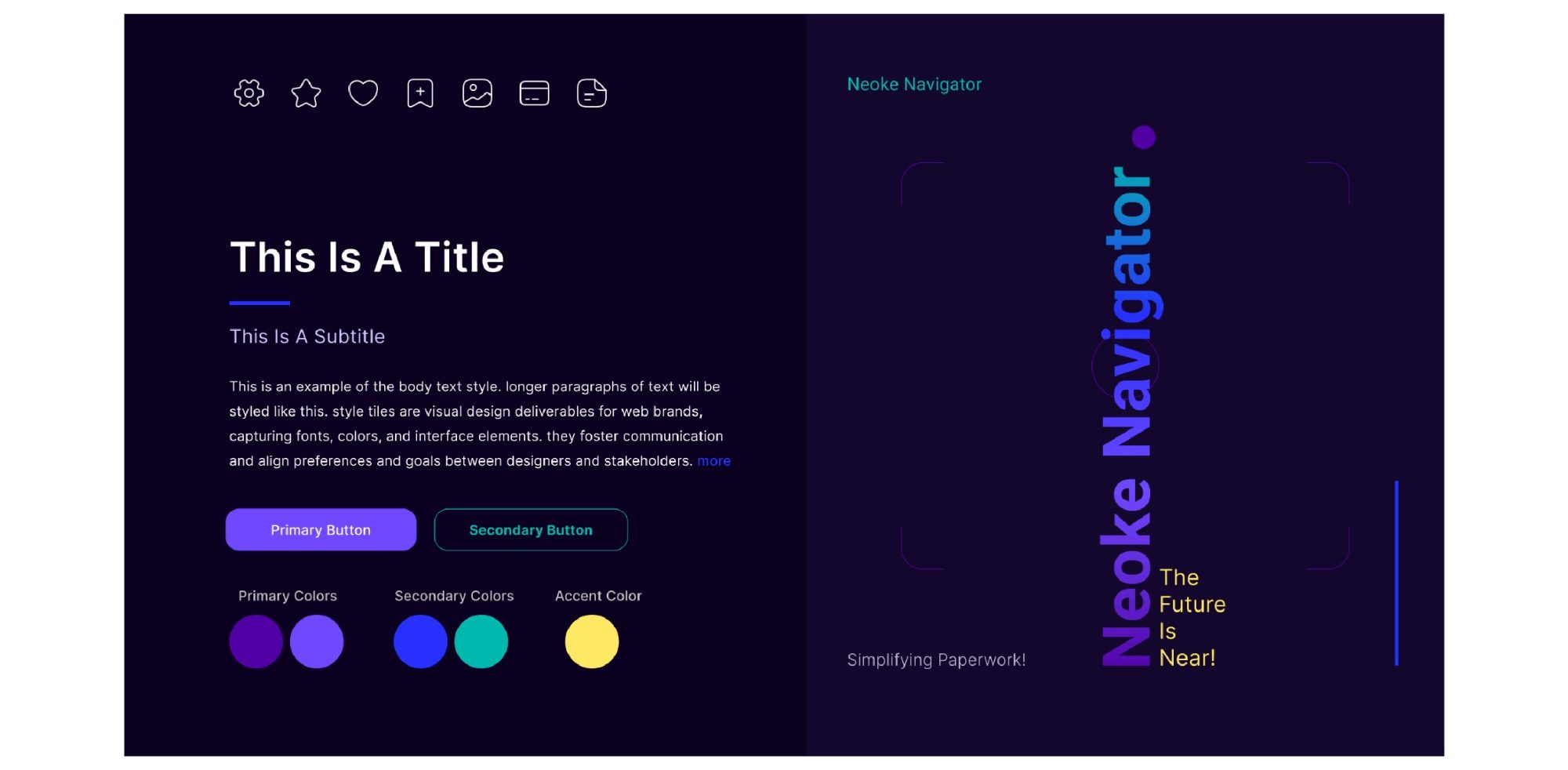
- Color Palette Refinement: Building on the moodboard insights, we adjusted the color palette, retaining the core purple while introducing lighter shades and vibrant accents of green, blue, and yellow.
- Typography Choices: For readability and user-friendliness, we continued to use "Inter" in complex interfaces and selectively incorporated "Roboto" for titles and essential information.
This approach aimed to maintain brand consistency while making the app inclusive and appealing to a wider audience, aligning with our goal of enhancing the travel experience for families.
High-Fidelity Prototype: Bringing Neoke's Vision to Life
In the high-fidelity phase, we created a Figma prototype guided by Style Tile guidelines and insights from mid-fidelity testing. Beyond the check-in paper form task, we explored key app features:
- Wallet: Users could easily access and manage ID and travel documents, including custom cards.
- Profile: Users could edit identity, health, and personal preferences for a personalized experience.
- Check-in Process: Streamlined digitization, auto-fill, and sharing of forms.
- AR Live Navigation: Overlaying useful notes, enhancing translation, and ensuring safe dining experiences.
This prototype showcased Neoke's potential to revolutionize travel, making it efficient, personalized, and user-friendly.
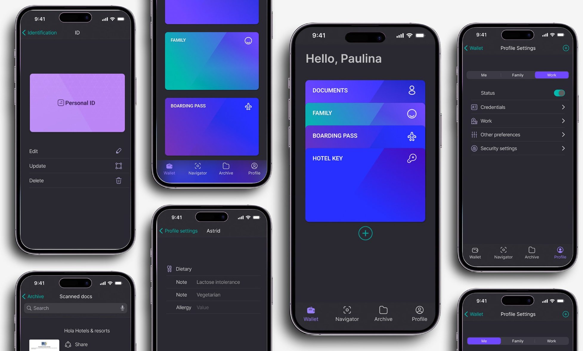
Wallet: Users could easily access and manage ID and travel documents, including custom cards.
Check-in Process: Streamlined digitization, auto-fill, and sharing of forms.
Profile: Users could edit identity, health, and personal preferences for a personalized experience.
AR Live Navigation: Overlaying useful notes, enhancing translation, and ensuring safe dining experiences.
Accessibility Testing
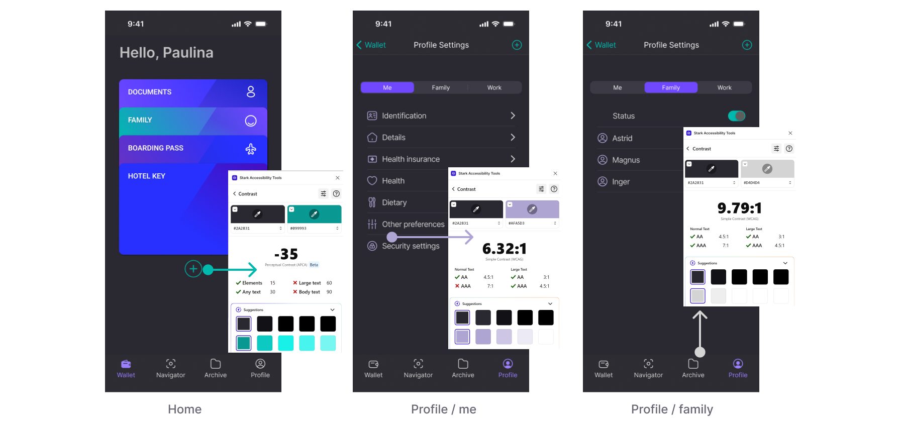
Ensuring accessibility is a cornerstone of our design philosophy for the Neoke App. We understand the importance of making technology inclusive for all users, regardless of their abilities.
- Color Contrast: We followed accessibility guidelines to maintain proper color contrast, aiding users with visual impairments.
- Alternative Text: All images have descriptive alternative text for screen reader users.
- Focus Indicators: Clear focus indicators were added for interactive elements.
- Content Structure: We maintained a logical content structure with proper headings and semantic HTML elements for better navigation.
04
Going Forward
. Take aways
. Next Steps
What I Learned
Throughout this project, I learned the value of empathy-driven design. Understanding the frustrations and needs of users, even when they may not be immediately apparent, was instrumental in shaping our solution. I also learned the importance of flexibility in design, as we adapted to evolving requirements and stakeholder expectations. Lastly, I gained insights into the potential of technology like Neoke to transform not just travel but various aspects of daily life.
Next Steps
Our future plans include:
- Expanded User Testing: To gather valuable feedback and make data-driven improvements to the app.
- Iterative Refinement: Continuously improving functionality, usability, and aesthetics.
- Collaboration with Developers: Engaging with the development team early in the process.
- Exploring New Use Cases: Extending the Neoke app's potential beyond travel.
- A/B Testing: Implementing A/B testing to enhance the user experience.
Conclusion
Thank you for reviewing my Neoke App case study. If you have any questions or opportunities related to UX/UI design, please feel free to reach out directly. I look forward to potential collaborations and job opportunities in the field. Your consideration is much appreciated.
© Made with love © 2023 Parvin Bayathojati
Wir benötigen Ihre Zustimmung zum Laden der Übersetzungen
Wir nutzen einen Drittanbieter-Service, um den Inhalt der Website zu übersetzen, der möglicherweise Daten über Ihre Aktivitäten sammelt. Bitte prüfen Sie die Details und akzeptieren Sie den Dienst, um die Übersetzungen zu sehen.

